10 Elements to Design the Best Nonprofit Website
Much like your nonprofit, your website should be driven by a core mission. Your objective? Provide educational resources to all who come across your organization and financially support your cause with undeniable professionalism and transparency.
To that end, your website needs to be your handshake, your introduction, your first impression, and your pitch.
If you’re looking to wow your web visitors and potential donors, there are ten essential design elements to consider.
1. Headings
See the word right above this sentence? That’s a heading.
Headings help break up your content into quick, easily digestible chunks. You can also use sub-headings and sub-sub-headings to group similar ideas together.
Whether it’s your home page or a weekly blog post, try to incorporate a heading every 50-100 words or so. Your content will be more skimmable, and visitors will be able to navigate your site with ease.
2. Page Titles
Also called title tags, page titles are a vital piece of the SEO (search engine optimization) puzzle. The page title shows up next to your website name in Google’s search results, and it’s a phenomenal way to make your site look welcoming and professional.
When you improve your SEO as a small business, you make it easier for users to find you online. And if you’re using a website creator like WordPress or Squarespace, you can add a page title anytime you publish a new page.
3. Font Choice
Maybe your website is chock full of words. Or maybe it’s more like an IKEA manual—few words, but jam-packed with informative graphics.
Either way, you’ll want what words you have to stand out. And for that, you need to choose your font wisely. A stellar font is:
- Legible
- Aesthetically pleasing
- Perfectly fit to your branding
- Available in several variations (bold, extra-bold, etc.)
But choosing one fantastic font isn’t enough to create the best nonprofit website—you must also consider how your fonts work together.
Basic font etiquette recommends pairing a sans serif font with a serif typeface. For more on mixing and matching typefaces, check out our guide on the best Google font combinations of 2022.
4. Images
A swirly font may be attention-grabbing, but nothing pulls focus quite like a high-definition image. So, save the wall of text for academia!
Instead, jazz up your nonprofit’s site with colorful graphics and photography that keeps your visitors entertained as well as informed.
People are visual creatures, and that old saying “a picture is worth a thousand words” rings true. By sprinkling images throughout your site, you can say so much more about your nonprofit. Ideally, you’ll always have at least one picture visible, no matter where your users scroll.
5. Color Choices/Scheme
The colors on your website shouldn’t be limited to imagery, either. As you design your nonprofit site, think about your color scheme as another way to deliver your message.
Rather than choosing a color because it looks nice, think about how it will make your visitors feel. Warm reds and yellows evoke energy and passion, while cooler colors like blue and purple are more calming.
Your color choices should be consistent across your website—and consistent with your branding as a whole.
6. Creative Copy
Your web copy—that’s all of the writing on your website—is the bread and butter of your nonprofit’s page. Through this copy, your visitors can find information about your latest events, navigate to donation pages, and learn more about your mission.
With that in mind, any text on your website should
- Be fun to read
- Be short and sweet
- Align with your brand voice
7. Client Stories/Testimonials
You may have heard the term “social proof” in marketing. Reviews and testimonials are excellent examples of this phenomenon. In short, social proof dictates that individuals follow the actions of others.
Someone who has never heard of your organization may not be inclined to donate. But if they see countless positive reviews from former members, they’re more likely to see you as a trustworthy and impactful community leader. And as you know, trust is everything in the nonprofit world.
8. Mobile Responsiveness
85% of Americans own a smartphone and 15% use only their phone to access the internet.
In this day and age, designing a mobile-responsive website isn’t just recommended—it’s practically required. If you want to reach the most people and give them the best possible experience, you need a mobile-friendly website.
Luckily for you, our team at Puzzle Pieces Marketing makes it easy to optimize for on-the-go scrolling. Just take a look at the site we designed below!
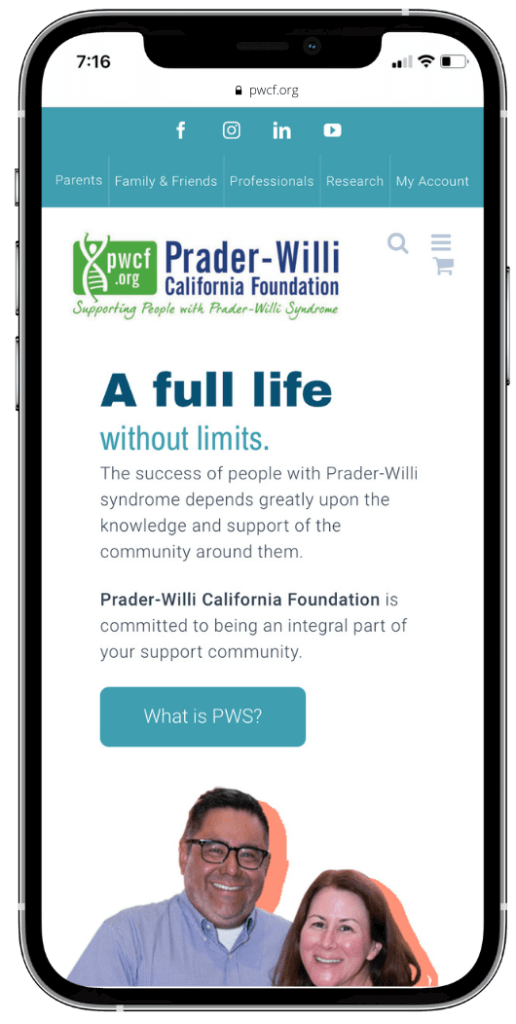
PWCF.ORG Mobile Website
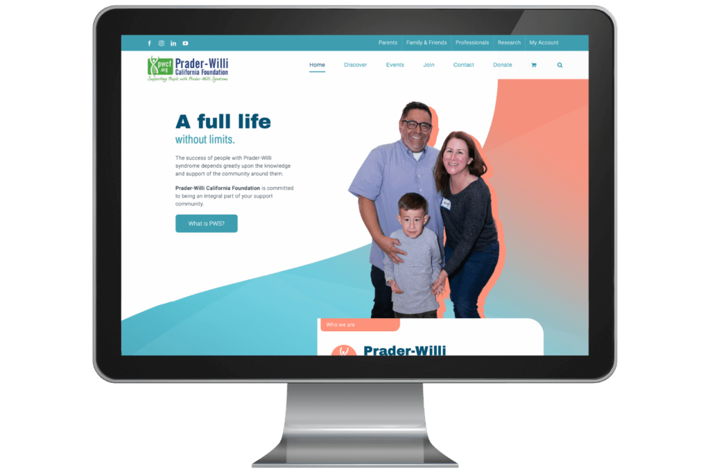
PWCF.ORG Desktop display
9. Page Speed
When a web page takes more than a few seconds to load, you’re inclined to exit the page with gusto and find the next best (or quickly loadable) option. You don’t have all day to wait around—and neither do your patrons.
Page speed is important for any website, but it’s essential for a nonprofit. Why? Because you’re asking site visitors for their time, money, or both. If any part of the process is even slightly inconvenient, you risk losing a sizable donation.
10. Social Sharing Links
You know those little social icons you see at the bottom of a web post? Scroll down a little, and you’ll see what we mean. Those are social sharing links.
Depending on the angle of your nonprofit, you may want to include sharing links for:
The easier it is for your visitors to share, tweet, and pin your nonprofit, the better chance you have of reaching new audiences. You can usually add social sharing links through your website creator tool.
What Else Do You Need? A Rockin’ Team Behind You!
Whether you’re a tad savvy in web design or an internet initiate, it can be challenging to do everything on your own. That’s where we come in.
At Puzzle Pieces Marketing, we’re creators, innovators, and developers. We know how to make a nonprofit website pop.
If you’re ready to take your site to the next level, drop us a line. We’d love to hear all about your projects and plans.
Sources:
Pew Research Center. Mobile Fact Sheet. https://www.pewresearch.org/internet/fact-sheet/mobile/


