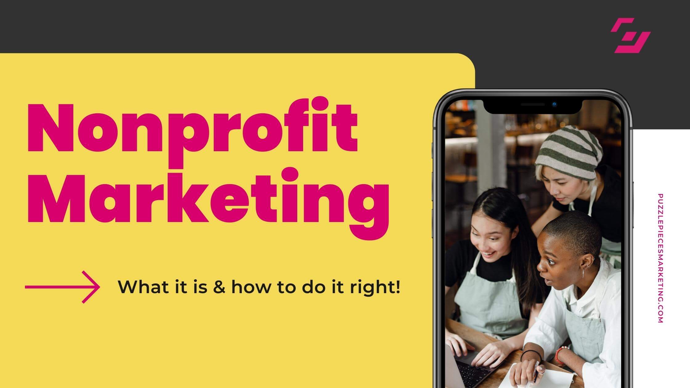
8 Best Google Font Combinations 2023
Google Fonts is a free online source for fonts, with hundreds of incredible picks available to download. Finding one top-notch font for your website is easy enough. But what about when you need a complementary pair?
We’ve got you covered.
In this up-to-date guide on mixing and matching fonts, we’ll be looking at eight of the best Google Font combinations of 2023.
1. Lato & Raleway
For body text, clean and simple is always the goal, and Lato certainly fits the bill. This sans-serif font feels familiar, but not over-used. Best of all, it comes in ten different weights.
For a matching title font in the same vein, our pick is Raleway. The two typefaces are similar enough to feel cohesive but contrast to give readers’ eyes a break.
If you want to add even more funkiness, you can try the Raleway Dots variation.
2. Italiana & Cinzel
For a more sophisticated take on body text, try Italiana. This highly-legible font has a touch of Old World charm (as the name suggests), with a nod toward contemporary. The font consists of thin horizontal bars and thicker downward strokes, always reaching a perfect balance of white space for an easy read.
In keeping with the theme, Cinzel has an almost regal feel to it. An all-caps serif font, Cinzel is the obvious choice for a bold, eye-catching header. When paired with Italiana, the result is a feeling of modern elegance.
3. Roboto Condensed & Roboto
One way to maintain a cohesive look is to use two fonts of the same family. For body text, Roboto Condensed works wonders. The tight spacing between the characters (called “kerning”) makes it easy to write long-form content without overcrowding the page.
For titles, Roboto acts as the perfect partner. The two fonts were literally made for each other, so it’s no surprise they work like a dynamic duo. There’s more space between the letters in Roboto, so even shorter headers can stretch comfortably on the page.
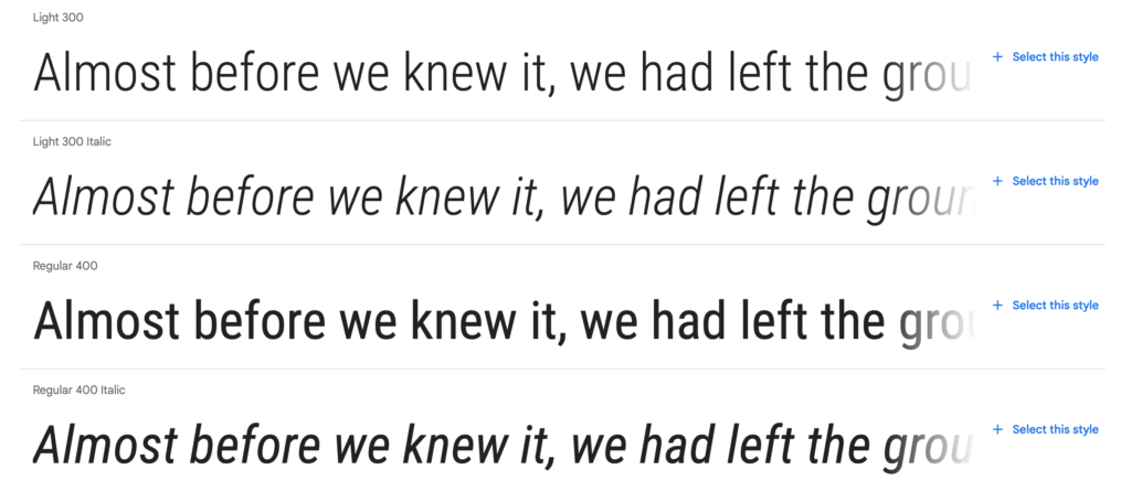
Variations of Roboto Condensed
4. Open Sans & Merriweather
Open Sans is another classy sans-serif font that makes online reading easy. With more than a dozen weights and styles, you can easily make parts of your body paragraphs stand out without adding a third font family.
When you choose a font like Merriweather for your titles, you give your site a journalistic feel. The serif font would be right at home in a newspaper—and it looks even better sitting above Open Sans Light.
5. Noto Sans & Cinzel Decorative
A Google-made font, Noto Sans is a blank canvas for your words, meaning it’s basic in the best way. The Noto font family is especially useful for body paragraphs on multilingual sites, as there are options for:
- Japanese
- Korean
- Traditional Chinese
- Arabic
- Thai
- Hebrew
- Khmer
For titles, you’ll love Cinzel Decorative. Its lowercase letters look exactly like plain old Cinzel. But hit the caps lock key, and you’ll be treated to a buffet of swirling brushstrokes that extend above and below the letters. The pizzazz of Cinzel Decorative contrasts nicely with the simplicity of Noto Sans.
6. Montserrat & Great Vibes
Montserrat often works as a header when paired with serif fonts. But here, this sans-serif winner makes a marvelous body text. It’s bold without feeling thick, and it comes in any weight you could ever need.
For a more unique pairing, we suggest Great Vibes as a title font. Because who doesn’t love great vibes? It’s a curly script with a handwritten feel, but unlike most handwritten scripts, it’s legible. Add a touch of class (and some good vibes) to any website with this combination.
7. Poiret One & EB Garamond
Even though Google Fonts lists Poiret One as a display font, we love it for longer paragraphs, too. It’s a decorative choice that doesn’t sacrifice legibility. Plus, with its art-deco origins, you’ll create a unique aesthetic on the page.
Most simple serif fonts pair well with Poiret One, but our pick for a headline is EB Garamond (Bold). Garamond is a classic that complements the modernism of Poiret One. When you choose one of the bold variations of the font, it contrasts well against Poiret One’s thin lines.
8. Mulish & Lobster
By now, you’ve probably noticed that sans-serif fonts are popular for paragraphs, and Mulish is no exception. Sans-serif typefaces tend to look cleaner on computer screens, which is why you find them all over the web.
With that said, the title font can be a place to have some fun. For that, there’s Lobster. This bold typeface is a whimsical, almost cartoonish choice. If your brand is more upbeat and playful, you can’t go wrong with Lobster.
Find a Font-Tastic Fit with Puzzle Pieces Marketing
Choosing the right combination of fonts for your website is challenging. And if you’re a busy nonprofit, a decision like “semi-bold or bold” might seem too trivial to spend your time on.
That said, web design is an equally vital part of your mission. After all, every campaign you launch will inevitably lead philanthropists back to your home base—aka, your website.
If you need a hand creating a functional, beautiful website, get in touch with us today. Here at Puzzle Pieces Marketing, we’re font fanatics, and we’ll gladly show you more of our favorite combos that match your brand.
Sources:
Adobe. An introduction to kerning. https://www.adobe.com/ca/creativecloud/design/discover/kerning.html