California
Housing Partnership
Since 1988, the California Housing Partnership has worked to ensure that funds for long-term, sustainable affordable homes make it to the mission-driven organizations that build and preserve it, and advocated for the refinement and expansion of those funding sources as well as the creation of new ones.
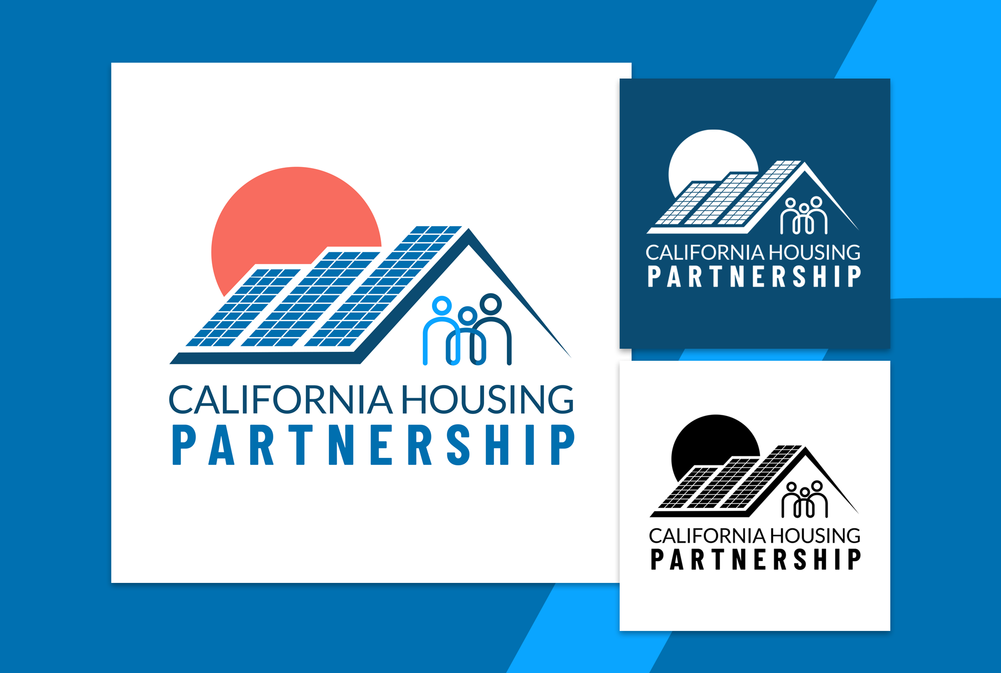
Puzzle Pieces Marketing led a full rebrand for California Housing Partnership, modernizing their identity to reflect their leadership in advancing affordable housing solutions and policy across California.
What we did:
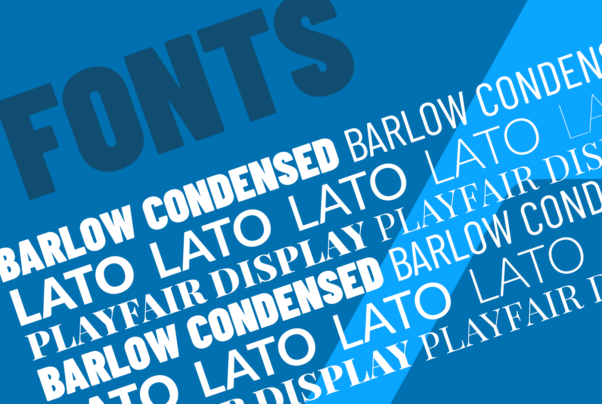
- New Logo: Designed a refreshed logo that conveys stability, community, and forward momentum.
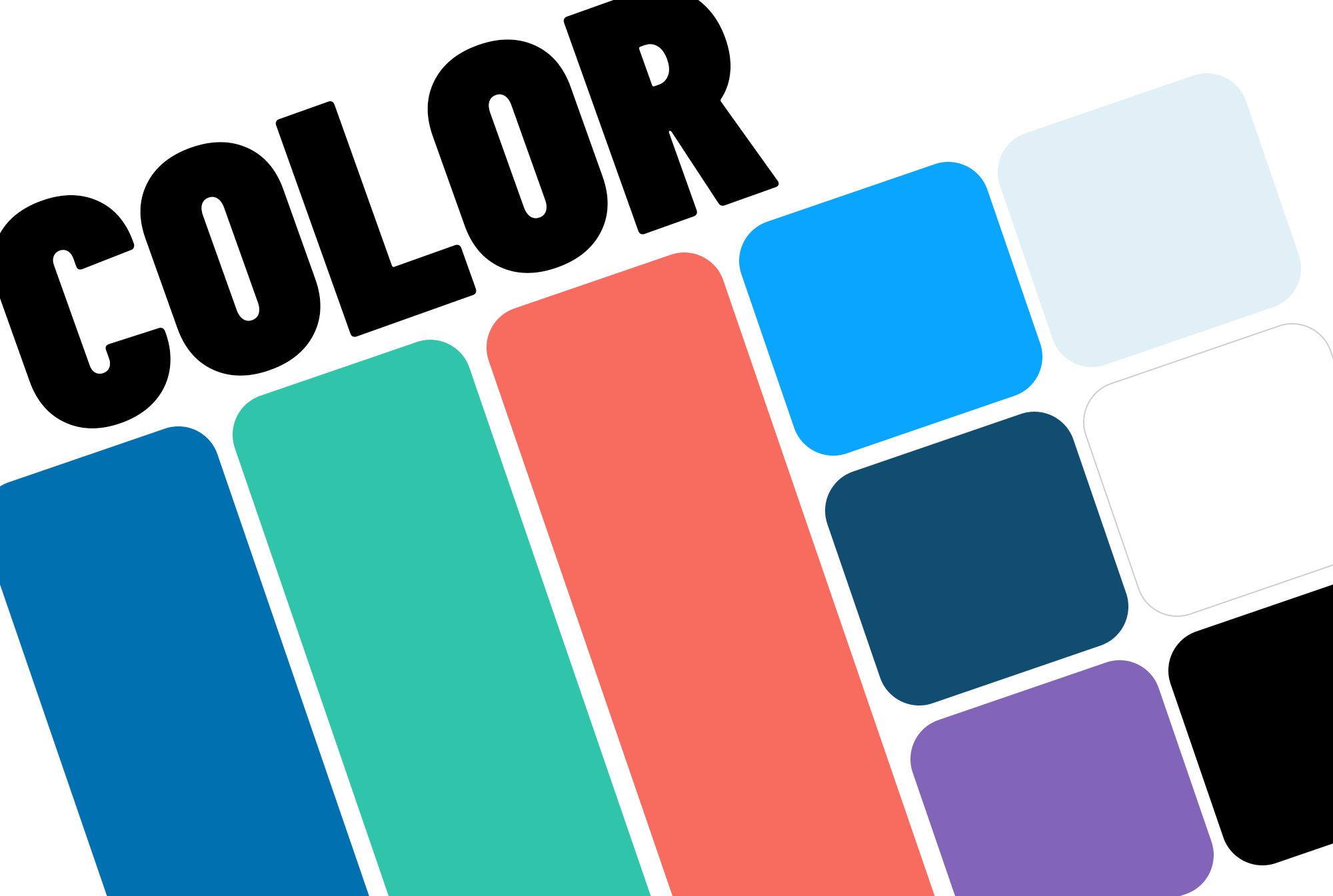
- Color Palette & Typography: Introduced a professional, approachable palette and modern typography to elevate readability and brand recognition.
- Iconography & Graphics: Created custom icons and visual elements to support storytelling and data communication.
- Imagery Guidelines: Developed guidance for photography, illustration, and imagery to ensure consistent visual representation.
- Layout & Design Standards: Established rules for applying icons, graphics, patterns, and other branded visuals across platforms.
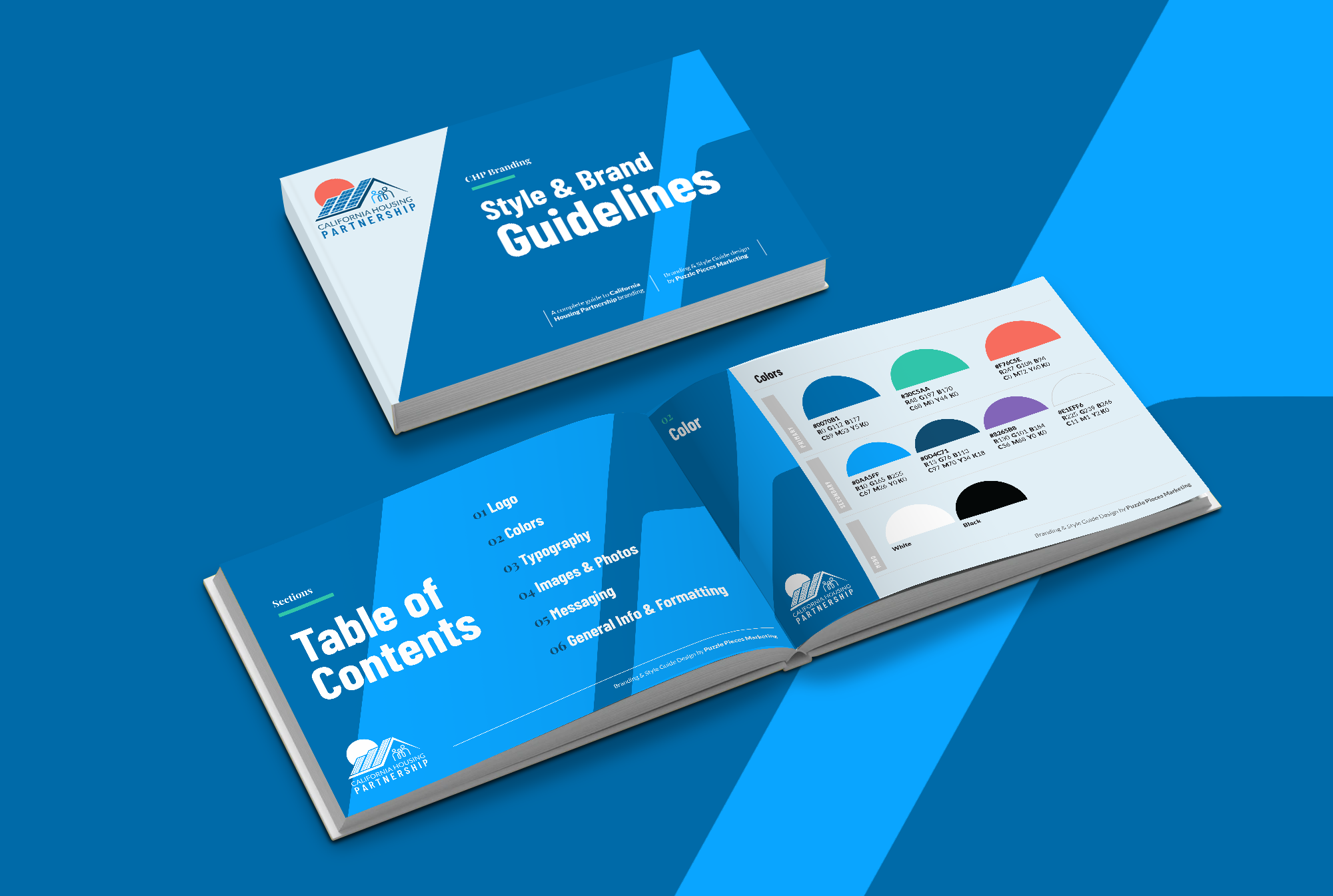
- Brand Guidelines & Style Guide: Delivered a comprehensive guide to ensure consistent use of all brand elements.
Outcome: The rebrand provided California Housing Partnership with a cohesive, modern identity that strengthens their communications, enhances accessibility, and reinforces their mission to advance housing justice throughout the state.
At the heart of this project was our mission to make California Housing Partnership’s website easier to explore and more enjoyable to use. We transformed the user experience into a smooth, intuitive journey where visitors can quickly find the information and resources they need.
Our web design & development team crafted a clean, engaging mega menu that makes navigation effortless. With just a click, users can dive into every section of the site.
We paired the refreshed functionality with a modern design that reflects California Housing Partnership’s updated brand identity. The result is a polished, user-friendly digital home that informs, engages, and empowers visitors.


Increased Google Page Speed for:
Before
Site Performance
Accessibility
Best Practices
SEO
After